Paradoxes in the co-evolution of contagions and institutions
Exploring the co-evolutionary dynamics between epidemic spreading and institutional adaptation (J. St-Onge, G. Burgio, et al, 2024).
Control the axis of the phase diagrams:
Note: μ is fixed at 0.0001. Pale asterisks indicate retained data point. See warning for details.
Note: μ is fixed at 0.0001. Pale asterisks indicate retained data point. See warning for details.
The visualization may give slightly different results than our paper. To keep the visualization lightweight, we sparsified the raw output with .sparsify.py#L5-L9. In the highlighted lines, we throw away points where the absolute difference between two time steps is greater than 0.0001. This lead to premature termination of runs and more rough results. That said, the results should be qualitatively the same in the paper. If not, please let us know. Also, in the paper we use different initial conditions to demonstrate different mechanisms, which we didn't reproduce here. Finally, note that if the range input is disabled or a parameter is missing, is that we didn't run the parameter sweep with this set of values
Decomposing the call for action
Reducing the copying rate enough, we observe the prevalence curve becoming non-monotonic, with multiple local minima. As we increase
How do I interpret the quadrant?
Consider the following
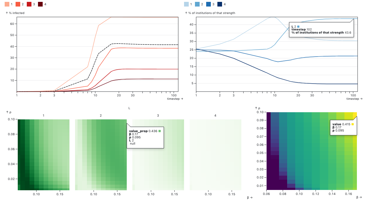
- The upper left quadrant represents the time evolution of the average number of people infected by institution level. The dotted line is the global average, here converging to about 41% of people being infected.
- The upper right quadrant is the proportion of institutions of that strength. We see that 43.6% of institutions converged onto level two. Institutions weren't willing to pay the cost and invest stronger institutions than level4 in this case.
- The bottom left figure is basically the same plot than upper right, but this is a phase diagram to know how institutional proportional change as a function of relevant parameters in the model, here rho and beta. We can see the phenomenon of what we call parameter localization, where some institutional regimes take over part of the parameter space.
- Finally, bottom right figure is the equivalent for the upper left figure, i.e. the global average of infectedpeople over all regimes. This figure let us see how did the institutions perform for any combination of theparameter on the axes.